10 Logo Design Tips: How To Design the Perfect Logo
Logo Design is thinking made visual.
However, it is easier said than done.
On the face of it, logo designing process looks simpler however designing a perfect logo is very challenging task.
Logo design is not just about toying with colors, fonts, and fancy tag lines.
Logo design is an art as well as a science.
Your logo is your company’s face and identity.
In my last post, I explained how to choose a perfect brand name for your business and why your brand name should have a visual identity.
This visual identity is your Logo.
Some people just get their logo designs drawing on a napkin and some just get it easy by putting their brand name’s initials on the logo — while some faces a hard time for that perfect creative logo.
This article will help you with tips and ideas on how to design a successful logo for your business.
Here are my top 10 logo design tips on how to design the perfect logo for your brand.
Let’s see what the chaos to a great logo is all about:
1. Know Your Competitors
Start with your competitors.
Analyze what kind of logo designs competitors are using in your niche to reach out to their target audience.
This will help you get an initial idea of what is working and what is not.
However, ensure that you don’t fall in trap of designing similar type of logo as created by your competitors.
Try to be as unique as possible while creating your brand’s visual identity.
More your logo can stand out from the crowd in your niche, better it will be for you.
2. Define a Brief / Context
A logo is a true reflection of the brand.
From fonts to colors to symbols, everything speaks about values, benefits and personality — i.e. your brand identity.
But for that, first you need to write down your vision for the brand logo.
What’s your brand vision or brand story?
Try to tell your vision or story with your logo.
Telling a story through your logo is the most important way to connect with your customers.
You have to be very careful about what you want to communicate to your audience, what your brand is supposed to speak.
So, it’s important to empower your logo with right context, tone of voice and brand story.
Your logo should encapsulate all these key elements.
Let’s understand how to define a brief / scope for your logo!
Ask some key questions related to your brand.
- Who We Are?
- What we do?
- Why we are here?
- How we do it?
- Why are we different than our competitors?
- Who are we here for?
- What do we value the most?
- What’s our persona?
Be honest and to the point while answering these questions.
Define the answers in most tangible form and these answers will guide you during the logo design process.
Take a look what experts has to say about these logos:
“Their Marketing and their overall identity is aesthetically pleasing, but it’s their visual look that I’ve come to love” says one marketing expert when asked about Adidas logo.

According to Todd Waterbury: The enduring strength of Target’s logo lies in its utter clarity. The bull’s-eye is a symbol that is immediately, simultaneously seen and understood, one in the same, as precisely what it is.

“Disney is a fantastic example of timelessness” states one source.

3. Choose a Logo Type
There is no hard and fast rule to follow while designing a logo as it’s a pure creative process.
However, even a creative process can be put in a structure or a framework.
Same way, while creating a new logo, you can start with choosing the type of logo from 5 main types of logo categories and show some examples of each you’ll probably recognize.
1. Symbol Or Icon
This type of logo represents the company in a simple but bold manner.
In most cases, the image is abstract and stylized to give visual interest.
Some examples include:
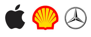
Most companies that use this type of logo will have a very simple main logo, but may choose to create additional alternative versions that appear a little more flashy.
The human mind can easily remember a simple form much easier than a complex one. It’s best to use a simple symbol or icon if you plan on building a large business.
2. Word Mark
These are uniquely styled text logos that spell out the company or brand name.
Some examples include:
![]()
Many times, custom fonts are created specifically for brands to use across all their marketing and branding collateral.
3. Letter Mark
Lettermarks are exclusively typographic.
They use a symbol representing the company through the use of its initials or the brands first letter.
Like a word mark, a letter mark is entirely text, but rather than the entire name of a business the logo relies on initials to represent the brand.
Some examples include:

Many companies choose to use this type of logo because their initials can better graphically illustrate the company better than the full name (name is too long), the name is hard to pronounce, or it’s just not distinct enough to carry its own weight.
4. Combination Mark
These logos combine a wordmark and a symbol or icon.

This type of logo help us add either or both elements with much needed flexibility.
Combination marks (occasionally known as iconic logotypes) are the best of both worlds, so it makes sense that they’d be so popular; they spell out the name of a company while simultaneously associating it with a visual icon.
Some examples include:

A well-designed combination mark looks just as good with the elements separate as it does with them together. You might recognize some combo marks like Hawaiian Airlines, Adidas and Sprint.
5. Emblem
An emblem logo encases the company name within the design.
Unlike combination marks, which position text and symbols side-by-side, emblems involve placing text inside of a symbol so that the two are practically inseparable.
Some examples include:
4. Keep It Simple
I can say it in hundred ways but essence is going to be same – Keep It Simple.
Logo designing is not about being big, bold and flashy.
Simplicity is the ultimate sophistication.
And logo is no exception when coming to keeping things simple yet sophisticated.
Your logo should convey a clear and simple message.
How to do it?
Give your logo a clear-cut personality that can elicit a reaction from the audience.
Don’t use your logo to display your typography skills or illustration knowledge in extreme measures.
Imaginative?
Yes of course.
All these brilliant logos like nike’s swoosh, bitten apple or twitter bird have few things in common:

Neat:
Say more with less.
Minimalism plays a pivotal role in logo designing.
Since it is often the most simplest design that catches the eye.
Memorable:
Be it McDonald’s ‘M’ or Nike’s ‘Just Do It’ right tick or Chanel’s double “C”s, they all are on people’s mind.
Simple:
The very best logos are quite simple and yet discoverable even on a tiny scale. Try to design your logo as an icon or a symbol that is social media and mobile app friendly.
Unique:
In the world of logo designing you are always looking to inspire everyone out there from your creativity and out-of-the-box thinking.
Take Honda’s logo for example, it is not a car but two people (dealer and buyer) shaking hands for building a connection.
Compelling:
It can either be just the font that you play with or the colors that you choose that may attract people to your brand.
But in any which case you have to make your logo appealing and attractive enough for people to like the ‘visual appeal’ to your business.
There are different unique ways to design a logo without going overboard:
- Bolder typography
- Geometric shapes
- Connecting all parts of the logo
- Using two colors to stand out or
- Going for a flatter design that is simpler and minimalistic at the same time
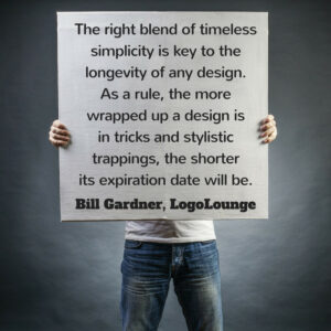
Avoid too much use of typography and iconography.
Any design element should be used in contextual sense only.
Too much decoration can make a logo feel cluttered.
My Advice: If you can’t say it in a simple way, it’s better not to say it.
5. Play The Color Game to Your Advantage
Choosing the right colors is the most important element of a logo design process.
So think twice (or may be more) before finalizing your logo colors.
If colors don’t fit in your logo, it’s bound to fail.
Confused about what to color your logo?
As an experiment, start with black and white colors.
This will help in giving a basic shape to the logo and its characters.
Once the shape of logo is defined, second step can be to choose colors.
First decide whether you want to stick with single color logo or prefer to go with two colors.

Source: Logo Factory
Here are the key colors, what do they represent and how to sue them smartly.
Yellow:
Clarity. Confident. Playful. Creative. Optimism. Positivism. Logical. Optimistic. Progressive.
![]()
Being the lightest hue of the spectrum, the color psychology of yellow is uplifting and illuminating, offering hope, happiness, cheerfulness and fun.
Use yellow to evoke pleasant, cheerful feelings.
You can choose yellow to promote children’s products and items related to leisure.
Yellow is often associated with food. Bright, pure yellow is an attention grabber, which is the reason taxicabs are painted this color.
When overused, yellow may have a disturbing effect; it is known that babies cry more in yellow rooms.
Within the meaning of colors, yellow is the great communicator and loves to talk.
Yellow is the color of the networker and the journalist, all working and communicating on a mental level.
Yellow is the scientist, constantly analyzing, looking at both sides before making a decision; methodical and decisive.
Yellow is the entertainer, the comic, the clown.
Yellow helps with decision making as it relates to clarity of thought and ideas, although it can often be impulsive.
Yellow helps us focus, study and recall information, useful during exam time.
Too bright a color to stand on its own and will require a secondary outline, background or bordering color.
Yellow is seen before other colors when placed against black. Yellow is very effective for attracting attention, so use it to highlight the most important elements of your design.
Men usually perceive yellow as a very lighthearted, ‘childish’ color, so it is not recommended to use yellow when selling prestigious, expensive products to men – nobody will buy a yellow business suit or a yellow Mercedes.
Dull (dingy) yellow represents caution, decay, sickness, and jealousy.
Light yellow is associated with intellect, freshness, and joy.
Famous Brands: Think of all the smiley faces ball, Mcdonald’s, Snapchat.
Orange:
Unconventional. Extroverts. Happy. Youthful. Energetic. Confidence. Sociable. Friendly. Affordable. Enthusiastic. Sunny. Fascination.

To the human eye, orange is a very hot color, so it gives the sensation of heat.
Nevertheless, orange is not as aggressive as red.
Orange increases oxygen supply to the brain, produces an invigorating effect, and stimulates mental activity. It is highly accepted among young people.
As a citrus color, orange is associated with healthy food and stimulates appetite. Orange is the color of fall and harvest. In heraldry, orange is symbolic of strength and endurance.
Orange has very high visibility, so you can use it to catch attention and highlight the most important elements of your design.
Most popular in retail sector. Considered to stimulate appetite and used in some warning labels. Orange is very effective for promoting food products and toys.
Dark orange can mean deceit and distrust.
Red-orange corresponds to desire, sexual passion, pleasure, domination, aggression, and thirst for action.
Gold evokes the feeling of prestige. The meaning of gold is illumination, wisdom, and wealth. Gold often symbolizes high quality.
Famous Brands: Firefox, Nickelodeon.
Red:
Action. Energy. Speed. Attention-getting. Assertive. Confident. Stimulating. Exciting. Powerful. Passionate. Stimulating. Courageous. Strong. Spontaneous. Determined.

Red is an intense color.
It enhances human metabolism, increases respiration rate, and raises blood pressure.
It has very high visibility, which is why stop signs, stoplights, and fire equipment are usually painted red. In heraldry, red is used to indicate courage.
Red works well on black and white backgrounds. Can mean stop, danger and hot.
Red brings text and images to the foreground.
Use it as an accent color to stimulate people to make quick decisions; it is a perfect color for ‘Buy Now’ or ‘Click Here’ buttons on Internet banners and websites.
In advertising, red is often used to evoke erotic feelings (red lips, red nails, red-light districts, ‘Lady in Red’, etc).
This color is also commonly associated with energy, so you can use it when promoting energy drinks, games, cars, items related to sports and high physical activity.
Light red represents joy, sexuality, passion, sensitivity, and love.
Pink signifies romance, love, and friendship. It denotes feminine qualities and passiveness.
Dark red is associated with vigor, willpower, rage, anger, leadership, courage, longing, malice, and wrath.
Brown suggests stability and denotes masculine qualities.
Reddish-brown is associated with harvest and fall.
Famous Brands: All sale posters you see, Netflix, Coca Cola, KFC.
Purple:
Royalty. Imagination. Mystery. Pomp. Wisdom. Ceremony. Creative. Unique. Majesty. Anything is possible.

Most expensive color to reproduce (it was made from hard-to-find sea weed) purple is often viewed as “elitist.”
Purple combines the stability of blue and the energy of red. Purple is associated with royalty. It conveys wealth and extravagance
The difference between violet and purple is that violet appears in the visible light spectrum, or rainbow, whereas purple is simply a mix of red and blue. Violet has the highest vibration in the visible spectrum.
According to surveys, almost 75 percent of pre-adolescent children prefer purple to all other colors.
It has a richness and quality to it that demands respect. Purple is ambitious and self-assured, the leader.
Too much of the color purple can promote or aggravate depression in some. It is one color that should be used extremely carefully and in small amounts by those who are vulnerable to these depressed states.
Light purple evokes romantic and nostalgic feelings.
Dark purple evokes gloom and sad feelings. It can cause frustration.
Famous Brands: Hallmark, Yahoo, Viber
Blue:
Cool. Dependable. Calm. Reliable. Tranquility. Trust.

Blue is the most popular corporate color.
It is the color of the sky and sea. It is often associated with depth and stability.
Blue is a masculine color and without doubt, it is highly accepted among males.
Dark blue is associated with depth, expertise, and stability.
You can rely on it to take control and do the right thing in difficult times.
It has a need for order and direction in its life, including its living and work spaces.
Avoid using blue when promoting food and cooking, because blue suppresses appetite. When used together with warm colors like yellow or red, blue can create high-impact, vibrant designs; for example, blue-yellow-red is a perfect color scheme for a superhero.
The color blue is idealistic, enhancing self-expression and our ability to communicate our needs and wants. It inspires higher ideals.
Light blue is associated with health, healing, tranquility, understanding, and softness.
Dark blue represents knowledge, power, integrity, and seriousness.
Famous Brands: A go-to color for many companies, IBM, Hp, Indigo,
Green:
Nature. Peace. Health. Serene. Fresh. Life. Harmony. Environment. Growth. New.

Closely associated with eco-friendly environment and products, peace and health.
It is the most restful color for the human eye.
Green is known to help alleviate depression, nervousness and anxiety.
It also promotes a sense of renewal, self-control and harmony. For this reason, television guests will wait in a “green room” to relax before going on air.
The secret to using green is moderation, especially when it comes to your business’ brand.
Use green to indicate safety when advertising drugs and medical products. Green is directly related to nature, so you can use it to promote ‘green’ products.
Dull, darker green is commonly associated with money, the financial world, banking, and Wall Street.
Dark green is associated with ambition, greed, and jealousy.
Yellow-green can indicate sickness, cowardice, discord, and jealousy.
Aqua is associated with emotional healing and protection.
Olive green is the traditional color of peace.
Famous Brands: Starbucks, Evernote.
Black & White:
Sophisticated. Luxurious. Somber. Serious. Formality. Style. Elegance. Expensive. Authoritative.

Most logos are actually designed in black & white first.
The color black relates to the hidden, the secretive and the unknown, and as a result it creates an air of mystery.
Black implies self-control and discipline, independence and a strong will, and giving an impression of authority and power.
Black gives the feeling of perspective and depth, but a black background diminishes readability.
Combined with red or orange – other very powerful colors – black gives a very aggressive color scheme.
Black color is used for making for “high-end” brand logos, striking logos, edgy & timeless logos.
Famous Brands: Nike, Puma, CN.
Grey:
Or silver for that matter, represents Simplicity, Neutrality, and Formal.

The color gray is conventional, dependable and practical.
Gray is controlled.
It has a steadying effect on other colors with which it comes into contact, toning down the stronger and brighter colors and illuminating the softer colors.
Famous Brands: Mercedes Benz, Swarovski.
Multi-Coloured:
Unity and diversity. Vibrant. Fun. Easy-going. Child-like. Internet. Multi-disciplinary. Authority.
![]()
Multi-colored and “rainbow” colored logos are a relatively new phenomenon due to the web and more economical four color printing. Represents a color-branding challenge.
Famous Brands: A multi-billion dollar company, Google.
Fore more brilliant color combinations, read this blog article form Canva.
You can always use Pinterest or Adobe Kuler for those perfect hues!
In case, you think a single color to your entire logo may build a strong presence for your brand, think Indigo’s Blue or Breast cancer’s Pink ribbon.
Or creating an iconic color combination like McDonald’s yellow-red or FedEx’s purple-orange.
Check out this video to get an idea on what a color behind a logo exactly states.
Source: The Logo Company
6. Create a Versatile Logo Design
Versatility is powerful tool to stand out your logo.
More versatile your logo design is – better brand visibility and eyeballs it can fetch you.
Try to be more dynamic and fluid while creating your logo.
Avoid being static and stagnated.
Stay open to possibilities.
It doesn’t mean changing your logo every quarter, but to be fluid in nature.
Versatility can enable you to showcase two different ideas or symbols at the same time.
When I say ‘Logo Versatility’ – it means that it looks great on all mediums (both online and offline).
Logo Design versatility at its very best!
Take a look at Apple’s logo, for instance, that can look good irrespective of the color scheme.

If your logo looks good on printed paper but poor on pen drive, then your logo will fail.
On the other hand, if your logo is dependent on ONE color scheme only, then it may harm your brand.
Idea is to demonstrate your logo in black and/or white or a different color scheme which are not part of the original color palette.
7. Don’t Over Experiment or Innovate
Experimentation is a good trait.
But going overboard with experimentation or innovation will not help.
Being too simple or too innovative can kill your creativity.
If a logo is tempered with too much tweaks / experimentation, it may give a good looking logo but ti will ruin the context and brand story.
Your creative energies should be devoted to tell the brand story through the logo by making it identifiable by the customers.
Once your customers are able to identify your logo and recall your brand easily, that means your logo design is successful irrespective of how generic or decorative it may look.
Remember: you’re designing a company logo and a logo is not an art masterpiece.
8. Use Typography Smartly
Sometimes typography is all you need to create an eye-catching logo.
Typography is the art and technique of arranging type to make written language legible, readable, and appealing when displayed.
Fonts are part of typography, but typography goes beyond fonts.
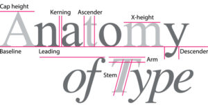
A typeface, like any form of design, is created by designer over a substantial period of time
When it comes to logo design, your typeface should be unique.
A custom hand-drawn typeface is way better than most gorgeous fonts anyway.
I recommend you to go with custom typeface as that will stop others from copying your logo typeface.
The ‘Visa logo’ has gone through a few redesigns over the years.
Here’s the latest look for the global credit card company, launched this January.

The new logo has removed the ‘yellow traces from the design.
However, very few would be able to find that out because of the iconic typography used by the company since long time.
Here are some of the great typography logo examples:
9. Use the ‘Negative Space’
Negative space may be most evident when the space around a subject, not the subject itself, forms an interesting or artistically relevant shape, and such spaceoccasionally is used to artistic effect as the “real” subject of an image. The use of negative space is a key element of artistic composition.
A great example here is of FedEx’s clever use of negative space.

Could you find it?
I request you to look closely again between letters ‘E’ and ‘X’…You could see an arrow… Yes. That’s intentional and a wonderful way of using negative space to your advantage.
While designing a logo with negative space, you should start with typeface based logo or a symbol based logo.
Shapes are designers closest friends.
And negative spaces are no exception too.
You can find shapes in negative spaces.
Once you find a shape then the next step will be to correlate real-world elements with shapes and use them in your logo’s letters.
In some of the world’s most famous logos, the use of negative space has not only helped to reinforce company messaging and logo recall, but it’s also made for some great PR.
Leaving white space or as we hear the term “negative space” in your logo screams attention.
Some of the popular examples include:

Not only fedex used this approach but the very famous Pinterest, Formula1, LG’s winking eye, Beats logo looking like a person wearing headphones went in for the same.
See this video to check if you can guess 16 FAMOUS LOGOS WITH A HIDDEN MEANING (That We Never Even Noticed).
10. Take a cue from these great logo examples
Some logos make it big while some… just don’t.
Either you become an inspiration or a lesson well learnt.
Here’s a small list of famous logos and the inspiration you can take from them:
I like wikipedia’s unfinished globe constructed from jigsaw pieces and the hidden bearin the mountain favicon of Toblerone.

Snapchat, the hugely popular social network, uses a mascot for their logo.
The premise behind Snapchat is that messages between users disappear after viewing, and as such the logo makes use of a ghost, and interestingly they have two variants of the logo – one with a face, and one as the blank ghost shown above.
The BR in the Baskin Robbins logo is made of two colours. When you focus on just the pink portion, the number 31 appears, denoting the number of flavours Baskin Robbins offers!

Derived from the Greek Goddess of Victory wing, ‘Swoosh’, Nike got its logo.
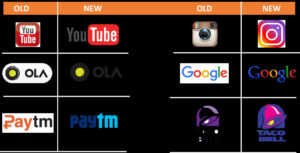
Many big brands evolved with changing time stating that there is no harm in rebranding unless you do it right. Say, Pepsi, Apple, Microsoft Windows.
Here are some of the brands that changed their logo:
Check out this list of startup logos that made it big and few examples below.
Wrap Up
I’ve shared 10 top logo design tips and some insights on how to design a perfect logo for your brand.
Logo design can be an enjoyable process (instead of a tedious one) if these tips are followed properly.
If you are a startup or a small business, you are definitely not thinking about putting in a lot of money for your logo design.
Guess what? You can get your logo design done for free or for less than $100.
Use online resources and tools!
Free tools like Canva, Logo Maker comes with unique options to help you customize your logo design.
Use Logo Yes for a better interface and ease of usage.
For collaboration and association when designing your company’s logo, you can turn to 99 designs.
You can also check out sites like awwwards, niice, pinterest for your fonts and logo design inspiration.
Maybe not the best but these tools do help you put your imagination to visual and at par with the iconic logo design already out there!
How did you come up with your brand logo design?
Was it a long, grueling process or a eureka moment?
What are your thoughts on the logo design tips shared in this article.
Do you have any logo design tips to share?
Is there any other question regarding logo design you would like to be answered?
Don’t forget to share what has been your experience.
Let me know in the comments section below or tweet me @iamnitinmalik.

